Logo or Penis?: Oak Park's New Phallic Symbol
An out-of-state community-branding consultant proposes a new Oak Park, Illinois, visitors bureau logo for the upscale, west-suburban town that looks a lot like...well...a phallus.

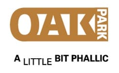
Today I refer you to my latest article on Chicagosphere. This week, an out-of-state "community branding" consultant stood up in front of the Oak Park, Illinois, village board and proposed a new visitors bureau logo for the upscale, west-suburban town. Trouble is, for a lot of folks, at first glance--and second, and third--the new logo looks a lot like...a phallus. It's a "you can't make this stuff up" controversy that caught fire in the Oak Park Twitterverse. Read all about it on Chicagosphere today, in The Oak Park Penis: Does the Village's New Logo Look Like a Phallus?
And don't say I didn't warn you.